Your accessibility scan passed. Why are customers still getting stuck?
The report looks reassuring. A customer still cannot sign in, correct a mistake or submit a request. Where did the test stop?
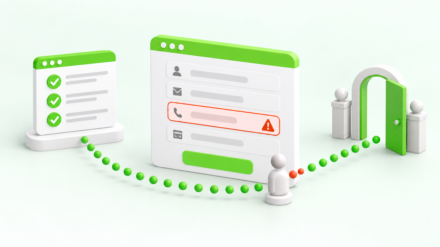
Picture a customer opening a support portal. They reach the form using the keyboard, but a sticky panel covers the focused button. After submitting, an error appears elsewhere on the page. Nothing announces it. The customer waits, retries and eventually calls support.
A scan may catch useful problems on that page. It cannot, by itself, establish that the journey works for people with different access needs. W3C recommends combining evaluation methods and involving users with disabilities. Read W3C’s evaluation overview.
There is no scanner score that equals AA. Conformance requires meeting all applicable Level A and AA success criteria, together with the conformance requirements, including full pages and complete processes. These checks are a starting point, not a complete audit. See the WCAG conformance requirements.
The next step disappears behind a panel
Press Tab. The page moves. But where did focus go?
Test with sticky headers, consent banners and chat panels visible. WCAG 2.2’s 2.4.11 Focus Not Obscured (Minimum), at AA, requires that author-created content does not entirely hide a component when it receives keyboard focus.
That is a minimum. Keeping the whole focused control visible is a better design target. A visible focus indicator and a logical order still need separate attention.
Navigate from the header to your main form using Tab and Shift+Tab. Open the usual overlays and repeat. Capture the exact point where the focused control becomes hard to find.
The right control is difficult to hit
Tiny close buttons and tightly packed icons can make a task unnecessarily demanding. The visible symbol and its clickable area are not always the same size.
Under 2.5.8 Target Size (Minimum), AA pointer targets are at least 24 by 24 CSS pixels, or meet a listed exception. Spacing can allow smaller targets to qualify; inline links and other cases also have exceptions. Measure the actual target and assess the criterion, rather than applying a blanket rule to every link.
Review the smallest controls in your busiest journey: dialog close buttons, pagination and calendar dates. Enlarge or separate controls where doing so makes the action easier and less error-prone.
Signing in becomes a memory test
The password manager is ready. The form insists on manual typing.
3.3.8 Accessible Authentication (Minimum) addresses cognitive tests during authentication. It allows specified alternatives, assistance mechanisms and exceptions; it does not simply ban passwords.
Support password managers and pasting where applicable. Test every authentication step, including verification codes. A six-box code field that accepts only the first pasted digit can turn a straightforward action into transcription.
Use a test account to sign in with a password manager, paste a complete verification code and follow recovery. Work with the identity team on accessible methods while preserving security.
The most useful test ends with a completed task.
A mistake leaves the customer guessing
Submit a form with a missing field, then with an invalid value. Does the message explain which field needs attention? Can a screen-reader user find it? Does correcting it preserve the information already entered?
WCAG includes requirements for identifying errors and providing labels or instructions. Where applicable, correction suggestions also matter. Do not rely on a red border alone. The Input Assistance criteria explain the requirements and exceptions.
WCAG 2.2 also introduces 3.3.7 Redundant Entry at Level A: information previously entered in the same process generally needs to be available without re-entry, subject to exceptions. Include multi-step forms in your review.
Make one deliberate mistake halfway through the journey. Record what the user sees, what is announced and how they recover. Test the recovery, not only the error’s appearance.
The page fits until someone zooms
A desktop screenshot does not reveal what happens when text becomes larger or the available width shrinks. Check whether navigation, instructions and actions remain available without overlapping or being clipped.
1.4.10 Reflow addresses presentation at narrow equivalent dimensions, with exceptions for content needing a two-dimensional layout. A useful practical check is 400% browser zoom from a 1280-CSS-pixel-wide viewport, giving an effective width of 320 CSS pixels. Test the actual task at that size.
Contrast remains part of an AA review too. A structural pass does not cancel a contrast failure. A different background or text treatment may solve a particular combination without changing the whole brand.
Zoom in, open navigation, complete a form and read its confirmation. Note the first point at which content or functionality becomes unavailable.
A custom component loses the user’s place
A dialog opens, but keyboard focus stays behind it. A results panel updates, but a screen reader receives no useful indication. A button looks correct, but its accessible name does not explain the action.
These problems need interaction testing. In Experience Cloud, include custom Lightning Web Components, Flows and third-party embeds in the journey. A standard-looking shell does not demonstrate that everything inside it behaves accessibly.
Open and close each interactive component with the keyboard and a screen reader. Confirm you can operate it, understand its state and continue from a sensible place afterwards. Record the browser and assistive-technology combination used.
Turn findings into fixes people can verify
Start with one important journey, such as signing in and submitting a support request. Combine automated checks, keyboard testing, zoom and screen-reader testing. Include people with disabilities in evaluation where possible.
- Describe the barrier: what prevents or complicates the task?
- Make it reproducible: include the page, user role, environment and steps.
- Map it carefully: identify the relevant criterion and distinguish a confirmed failure from an issue needing investigation.
- Retest the fix: repeat the original steps and check nearby behaviour.
Prioritise blocked tasks and widely reused components. Keep the scope of any accessibility statement aligned with what has actually been evaluated.
Sources and scope
This guide covers selected checks. It is not a complete WCAG checklist or a claim that a site conforms. Reviewed against W3C guidance in September 2026.