7 Experience Cloud problems that frustrate customers—and how to fix them
The portal is live. So why are customers still emailing your support team? Start with these seven checks before you start talking about a rebuild.
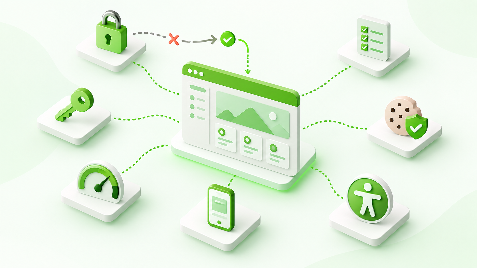
A customer signs in, opens their case list and sees nothing. Another completes a form on their phone, misses an error and starts again. Both end up contacting support.
These are the moments that decide whether a portal is useful. A polished homepage helps, but people return when they can finish the job they came to do.
Use this guide to find the friction, test the likely cause and choose a focused next step. The exact fix will depend on your site template, external-user licences and configuration.
Customers cannot see their own records
“It works for me” is not much comfort to a customer staring at an empty case list.
An administrator’s access does not tell you what an external user can see. Check the user’s licence, site membership, object permissions, field access and record sharing separately. Where supported, sharing sets can grant access through matching account or contact relationships.
Check guest access separately. Hiding a component is not a data-security control, and broadening public sharing to remove an error can create a much bigger problem.
Test with two customer accounts. The first should see its own record; the second should be denied access to it. Record both results.
Login becomes a dead end
The invitation arrives. The customer signs in. Then they land somewhere that does not help.
Trace invitation, registration, activation, password reset and sign-in as separate journeys. Check site membership, account/contact associations and the intended landing page. For single sign-on, review both the Salesforce and identity-provider configuration with the responsible owners.
Open an invitation in a fresh browser session and continue to a real task. Repeat with an expired link. Every failure should offer a useful next step.
The useful pages load too slowly
The homepage is fast. The page customers actually need is not.
Measure a specific task on a representative device and connection. Large images, repeated data requests, heavy components and third-party scripts can all add delay. Use browser performance and network tools to find the bottleneck before rewriting components.
Request only the records and fields needed, resize oversized images and use supported Salesforce data and caching mechanisms where appropriate.
Time the journey from opening a form to submitting it. Make one targeted improvement and repeat the same test, including a first visit with no warm cache.
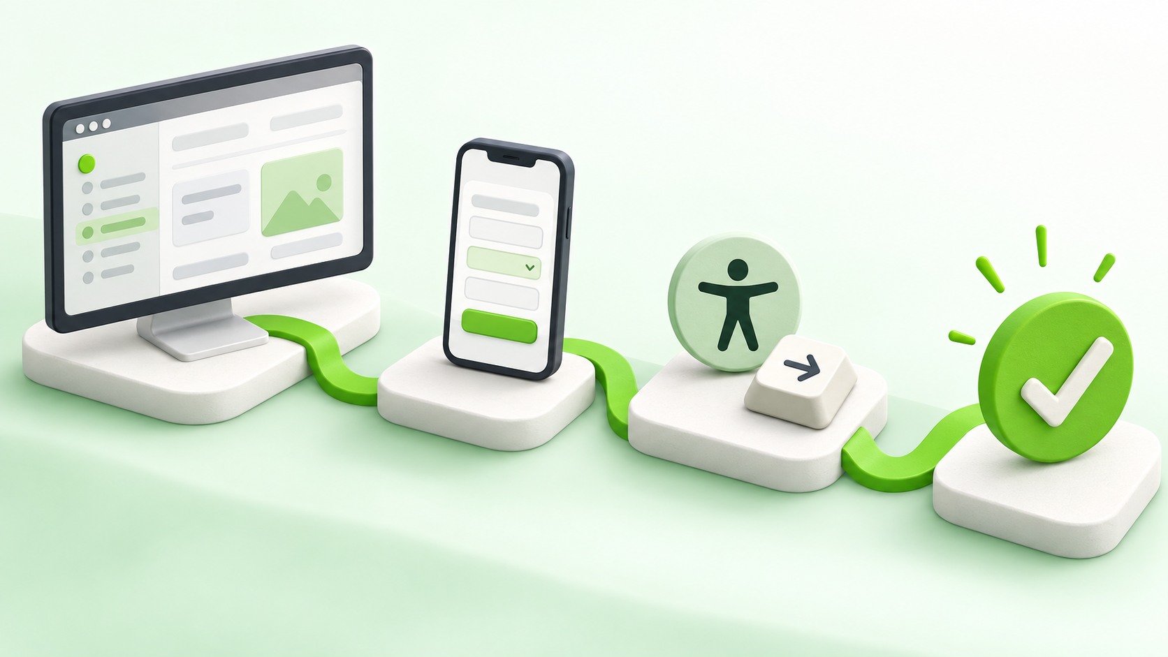
The mobile layout fits. The task does not.
A responsive page can still be awkward. The on-screen keyboard covers a button, a validation error appears out of view, or a wide table demands constant sideways scrolling.
Reduce unnecessary fields, keep labels visible and provide a clear confirmation. Make tables and attachments usable at narrow widths without removing information customers need.
Complete your most important customer task on a phone: open navigation, enter information, correct a mistake and submit. Note where you have to zoom, guess or start again.
A good score hides real accessibility barriers
A scanner gives reassuring results. A keyboard user still cannot finish the form.
Automated checks are useful, but a high score does not establish WCAG 2.2 AA conformance. Test navigation, custom dialogs and forms manually. Check meaningful headings, labels, errors, visible focus, zoom, reflow and contrast.
When a dialog closes, users should retain a sensible place in the journey. Screen readers need useful announcements when something changes.
Put the mouse aside and complete a task with the keyboard. Then test with a screen reader. Capture the barrier and affected component so the fix can be verified.
A successful portal visit ends with a completed task—not a support ticket.
The banner appears. Tracking ignores the choice.
A visible consent banner is only part of the job. A tag might load before a choice, restart after navigation or continue after consent is withdrawn.
Inventory the technologies in use and identify which require consent under the rules that apply to your site. Check storage and network activity before a choice, after rejection, after acceptance and after withdrawal. Include embedded content and tag managers.
If an integration is blocked, inspect Content Security Policy errors and runtime compatibility. Avoid weakening security controls as a quick fix.
Reject optional tracking, visit several portal pages and reload. Confirm the choice still controls actual behaviour.
One release fixes a page and breaks a journey
Shared components, permission sets and Flows can affect more than the page being edited. Testing only the changed feature leaves those connections unchecked.
Keep a short regression checklist for sign-in, record visibility, the main form, mobile navigation, keyboard use and consent. Test with representative roles and agree ownership, defect handling and a rollback plan.
Choose three critical journeys. For each release, record who tested them, which user account they used and what happened.
What should you fix first?
- Protect data. Investigate unintended access before cosmetic improvements.
- Unblock customers. Prioritise journeys people cannot complete.
- Remove repeat friction. Use support requests and observed behaviour to guide the next improvement.
For each issue, capture the user type, page, steps, expected result and actual behaviour. That turns “the portal is broken” into a problem someone can reproduce and fix.